"Obama admits 95% of income gains go to top 1%."
- CNN, September 15, 2013.
Chances are you've seen articles like this pop up in your Facebook news feed, along with angry commenters calling for revolution and storming the Bastille. The statistic conjures images of Mark Zuckerberg and Oprah laughing maniacally as they mug the poor. But take hope...
The 95% statistic is wildly misleading.

And if you put down your pitchforks and torches for a minute, I'll explain the major fallacies behind this statistic.
First, Some Background...
"During the 1980s, the wealthiest 1 percent of Americans got 70 percent of the income gains." - Bill Clinton and Al Gore, Putting People First, 1992.
This statistic helped Clinton beat Bush Sr. in the 1992 election (see page 77 of Alan Reynold's "Income and Wealth" for a thorough smackdown of this erroneous statistic). Awkwardly for Clinton, those same one-percenters made 45% of income gains throughout Clinton's tenure[1].
Bush Jr.'s presidency saw income gains continue to accrue to the nation's richest. Dubyah raised this 1% statistic in the run-up to the Obama-McCain presidential election [2]. In fact, this handy 1% statistic comes up in every election cycle. It even birthed the ninety-nine percent political movement in 2011.
So who are these pesky one-percenters?
The Non-Enduring Class Fallacy
The term "one-percenter" is a non-enduring class fallacy. There is no static class of individuals earning top 1% income gains year-over-year.
In fact, the smaller the percentage we choose, the larger the inaccuracy. Even if we make statements about 100% of Americans, we are not talking about the same individuals each year. People are born, die, or move away. Marilyn vos Savant, who holds a Guinness record for the highest recorded I.Q., made this point in her 1996 book "The Power of Logical Thinking."
 Berkeley produced the 1% study that currently has Obama in such hot water. But when the IRS and CBO present Berkeley with their raw income data, Berkeley does not get individual names of income gainers. There is no way to track who is in the 1% year-over-year.
So who are those 3.13 million people in this year's top 1%? Are they all palm-rubbing Goldman Sachs partners in $3,000 suits?
Probably not.
And it's not all athletes, artists, and entrepreneurs either.
Imagine a man selling the family farm to pay medical bills. Or an exonerated convict winning a legal judgement. Or a struggling screenwriter selling a script after a decade of waiting tables. The point is we don't know. This year they may be one-percenters. Next year they may be ninety-nine percenters.
So who's making all the money?
Only 63% of Americans are in the workforce. So roughly half the population makes all the money.
Also consider that people at the peak of their careers, age 54 - 64, have the highest income. Hey wait, 12% of the population is making most of the money! That's unfair! Oh wait, no. This makes total sense.
But let's get to the bigger fallacies...
Decile Analysis is Wildly Misleading
The Berkeley study cites decile analysis, which economists use to study income gains. The problem is, decile analysis can be used to say pretty much anything.
To understand why decile analysis is so clunky, consider the ten fictional households of Stokesville:

Let's say the household earner in Decile 9 launches her singing career. She signs a $200,000 recording contract! This poor Decile just made a lot of money, right?
Wrong.
The richest decile did...

...Because our singer jumped to the richest decile.
So the highest decile made a 100% income gain. And the poorest decile made no income gain whatsoever.
And now a journalist can claim the highest income decile made a 100% income gain at the expense of the poor.
Darn those wealthy people for making all the money!
But this is wildly misleading!
Yes. And this is the methodology of the Berkeley study and all other income distribution studies.
And it gets much, much crazier. Consider the following scenario in Stokesville: Everyone in Stokesville receives a 100% raise. Plus ten new jobs are created for the bottom five deciles!
Everyone wins, right?
Wrong again. According to decile analysis, the top half of Stokesville received 100% of the income gains while the bottom half received zero percent!
And despite getting equal raises, the top decile's income grew 95%. More than any other decile. Gains always accrue to the top decile.
But there are more fallacies to Berkeley's one percent study...
The Biased Sample Fallacy
Why does the Berkeley study only choose the time period of 2009 - 2012? According to their own numbers, the top 1% took 75% of the income losses during the recession of 2007 - 2009.
 So what are the cumulative numbers from 2007 - 2012? Did the wealthiest 1% only earn 20% of the income gains over that full period? Suddenly this news headline is a lot less sexy.
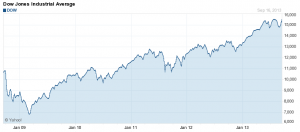
The wealthiest suffer more when the stock market crashes (2007 - 2009) and gain more when the stock market rises (2009 - 2012). The Dow Jones rose nearly 60% from 2009 - 2012 (see chart). Berkeley's choice to only report the income gains of one-percenters during a massive stock market run seems like a biased sample.
And now we get to the main point...
The Median-Mode Fallacy
Consider the following problem:
1) 9 people in Stokesville are 5 feet tall
2) 1 person in Stokesville is 6 feet tall
Therefore, the "average" height in Stokesville is 5 foot 1.
So 90% of the population is below average?
Now imagine a person moves to Stokesville who is 1 million feet tall. Suddenly, everyone is 100,000 feet below average. This is what happens when you introduce a billionaire into an economy…
The Billionaire Dilemma
 Imagine Stokesville has a total population of 1,000 millionaires. Plus one Warren Buffett (net worth ~ $60 Billion).
The stock market rises 10%. The 1,000 millionaires made $100,000,000! A good year!
But Warren Buffett made $6 Billion. So 98% of the income gains went to the top .001%.
Note the zero-sum fallacy. Everyone in Stokesville is wealthy. Everyone's net worth increased 10%. But a politician can argue that Stokesville is economically unhealthy because the uber-rich are taking 98% of the pie. Gains in the wealthy do not equal suffering in the poor.
Billions and billions…
Adding billionaire outliers to an economy kills income gain analysis. And we are fortunate to live in a country with 442 billionaires and counting. In 2007, before the financial crisis, America boasted 16,600,000 millionaires. That's 5.3% of the U.S. population. In 2007, an American had a one-in-twenty chance of being a millionaire. Even after the financial crisis, America has more millionaires than any other country.
As long as we have great innovators like Elon Musk, Jeff Bezos, Sergey Brin, and Larry Page, then we are going to have billionaires. This is great news. And yes, it will throw off our income gain statistics. It will destroy normal distribution curves and create wonky income studies. But the successes of the wealthy do not necessarily come at the expense of the poor.


 Berkeley produced


 Imagine Stokesville has a total population of 1,000 millionaires. Plus one Warren Buffett (net worth ~ $60 Billion).
